- Color shapes the mood, emotion, and style of boudoir portraits.
- The right palette helps boudoir photos feel personal and flattering.
- Wardrobe color should work with lighting, skin tone, and comfort.
- Texture, contrast, and fabric choice affect how each color appears.
- Covered outfits can still feel sensual with the right color and lighting.
Color can affect how we read emotion before we ever think about the details of a photo. A soft neutral may feel calming and intimate, while black can feel confident and classic. Deep red may suggest passion or intensity, while muted tones can create a sense of quiet vulnerability. In boudoir, these nuances matter because the goal is not just to create beautiful images, but to shape how you feel when you see yourself in them.
That is why color plays such an important role in creating boudoir pictures in San Diego that feel personal, flattering, and emotionally connected. In today’s blog, we will explore the psychology behind color choices in boudoir photography and how the right palette can influence mood, confidence, and self-expression. Keep reading to learn more!
What is the psychology of color in boudoir photography?
When you look at any portrait, color is usually one of the first clues your brain uses to understand the image. It helps you read the portrait as soft, bold, romantic, moody, clean, warm, or dramatic before you even get to turn your focus on the other elements. That is why color is not just a wardrobe detail. It affects the whole image, from how the lighting works with your skin to which parts of the portrait stand out first.
Color gives the portrait direction
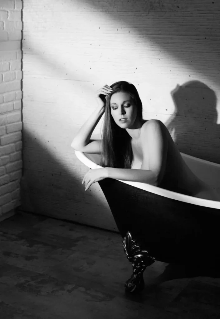
Color helps define what kind of portrait you are creating. A cream robe paired with soft lighting can look quiet and romantic. A black bodysuit with stronger shadows can make you look more sculptural and confident. A deep green or plum set can create a rich, fine-art mood without feeling overly bold.
This knowledge is useful during planning because the color palette gives the session a clear direction. If you want your images to look soft and understated, pale neutrals or muted tones may work well. If you want a stronger, more polished look, darker shades or higher contrast might be better. The goal is not to choose a “perfect” color, but to choose one that matches the way you want to be photographed.
Lighting changes the result
Color on camera depends heavily on light. A champagne robe may look warm and creamy in soft light, but cooler in a shaded setup. Black lace can show beautiful detail with the right contrast, but may look too heavy if the image is too dark. Jewel tones can look rich and elegant, but they need enough separation from the background.
This is why wardrobe color should not be chosen separately from lighting. The two work together, since lighting changes how color appears, which is why photographers consider both palette and light quality when building an image.
Color controls what stands out
Color also affects where the eye goes first. A dark outfit against a pale background can emphasize shape. A soft neutral palette can keep the portrait more blended and gentle. A bold lip, rich robe, or high-contrast fabric can become the main detail in the image.
This is especially important with close crops that focus on emotion. When the frame is tighter, there are fewer distractions, so color becomes more noticeable. A hand against ivory fabric, a shoulder framed by black lace, or a profile surrounded by warm tones can look more intentional when the palette is simple and controlled.
Which colors are the most flattering for boudoir photos?
The most flattering colors are the ones that work with your skin undertone, the lighting style, the mood of the session, and your comfort level. There is no single best color for everyone, but there are a few rules to go by when choosing the right ones for your photoshoot.
Start with your undertone
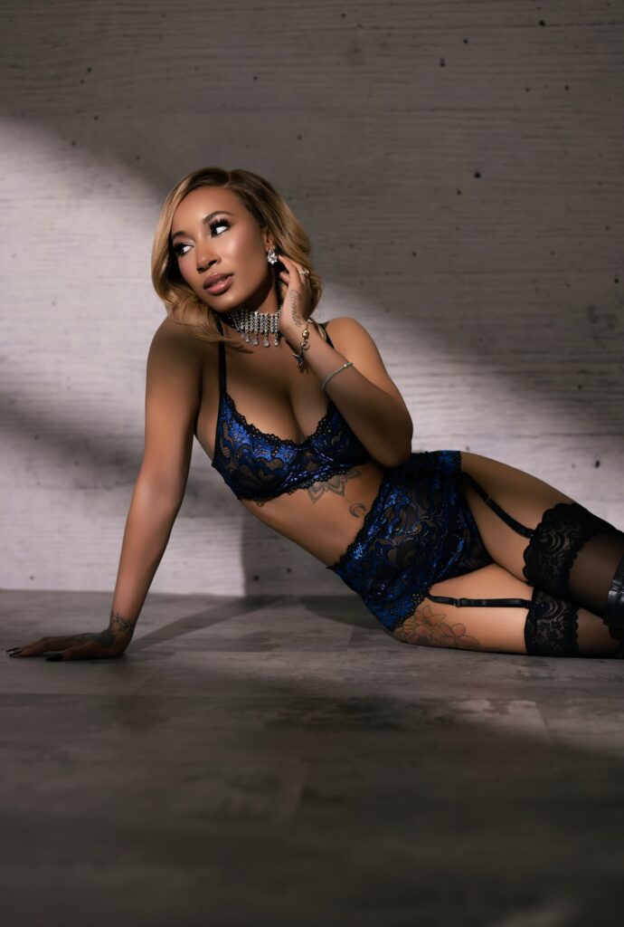
Your skin undertone can help narrow down wardrobe options. Warm undertones often pair well with cream, champagne, caramel, olive, rust, terracotta, chocolate, and warm beige. Cool undertones often work well with ivory, pearl, soft gray, mauve, navy, plum, emerald, and blue-based red. Neutral undertones usually have more flexibility and can move between warm and cool palettes.
These are helpful starting points, not strict rules. If a color technically suits your undertone but makes you feel unlike yourself, it may not be the right choice. Boudoir works best when the wardrobe supports both your features and your comfort.
Match the color to the final look
A practical way to choose your palette is to think about the type of gallery you want:
- Soft and romantic: ivory, champagne, blush, taupe, mauve
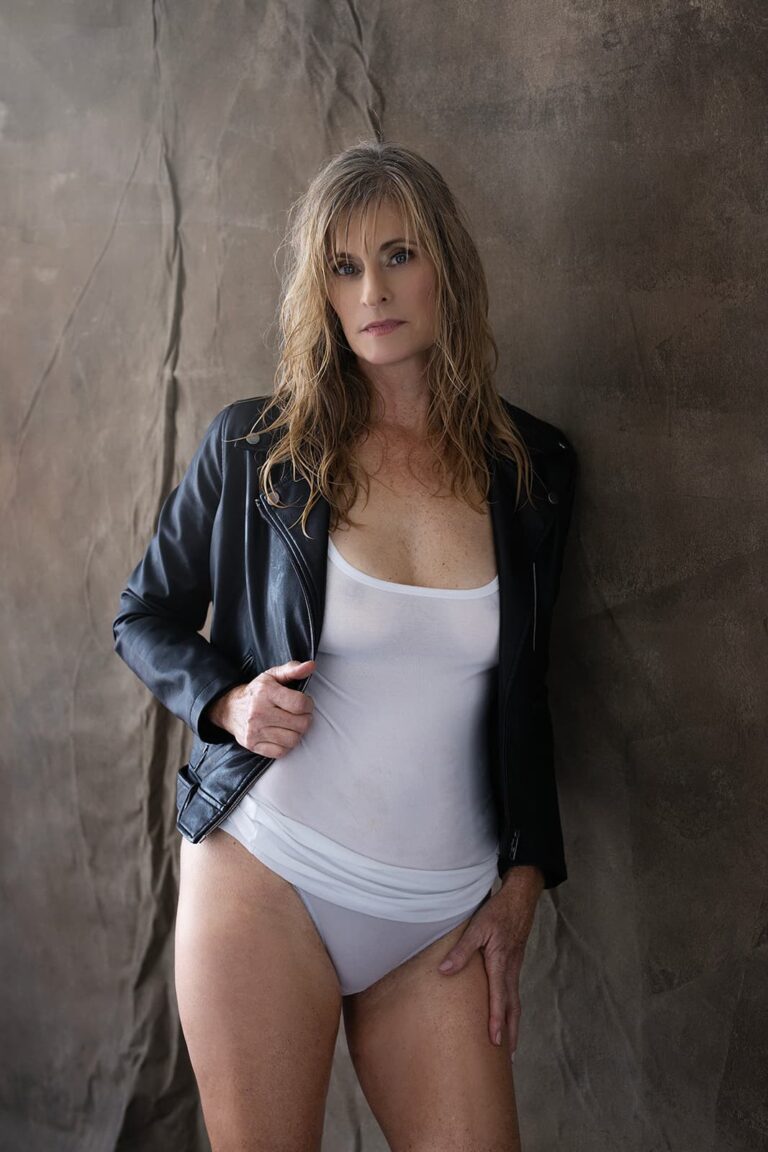
- Confident and classic: black, navy, espresso, charcoal
- Warm and intimate: caramel, rust, terracotta, cream
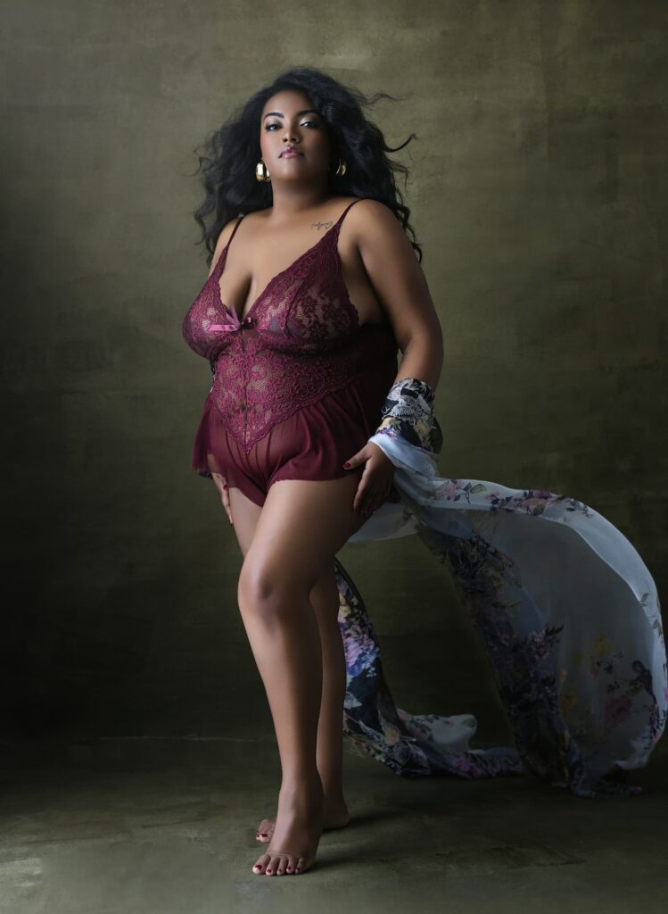
- Rich and dramatic: burgundy, plum, emerald, wine
Remember that texture matters too. Black satin reads differently from black lace. A cream sweater looks different from a cream silk robe. A burgundy lip creates a different effect than a burgundy bodysuit. The shade matters, but so does the material, fit, and where/how much the color appears in the image.
Consider contrast and skin details
Some colors create stronger contrast against the skin, while others soften the overall image. This matters if you are thinking about how visible skin details should be in your portraits. Tattoos, scars, stretch marks, and natural texture may stand out more with darker styling or stronger contrast. Softer tones and gentler light can create a more blended look.
Neither choice is wrong. Some clients want those details included because they feel personal. Others prefer a softer finish. Color can help support either direction without making the session feel overly staged.
Sensual does not have to mean revealing
Color can create intimacy even when the outfit offers more coverage. A loose button-down, soft robe, fitted dress, cardigan, silk wrap, or draped sheet can all photograph beautifully when the shade supports the mood you’re going for. Covered pieces can still look sensual when the color, texture, fit, and lighting work together.
Who can I contact for stunning boudoir pictures near me in San Diego?
At Portraits by Z, we help you make thoughtful choices before the session begins, including what colors, textures, and wardrobe pieces will support the look you want. You do not need to know your best angles or arrive with every detail figured out. We guide you through the process so your portraits feel comfortable, polished, and true to your personal style.
Our private studio, located in San Diego, near Petco Park, offers a calm space where you can slow down and enjoy the experience without pressure. From wardrobe guidance and professional hair and makeup to posing direction and final image selection, every step is designed to help you feel supported and beautifully seen. Schedule your free consultation with our team, and let’s plan a session that feels intentional, flattering, and completely your own!